What The Font?!
Another day begins at Anonymous Surrey Based Game Development Company. I'm a tech programmer here, and at the moment I'm rewriting the font rendering system for the game I'm working on.
The existing system was not amazing in a number of ways; it was confusing, pretty slow and didn't look great. The latter factor especially is not a plus point for a text renderer. The one redeeming feature I could see was that it had an intriguing compression system.
The Playstation 2 is not as powerful or as good as most people think. The games that come out on it look amazing largely because of incredible amounts of hard work by the programmers to squeeze every last drop of performance out of it. The game we are working on is being developed simultaneously for Playstation, XBox and Gamecube and the Playstation is "the lowest common denominator" of the three - if it works well on that it is expected to work well on the other two platforms.
However, back to fonts. The main limitation of working on a console (when compared to a PC) is the lack of memory. The PC gives us virtually unlimited memory (called, coincidentally enough "Virtual Memory") as the operating system manages the memory for us and "pages" it on and off the hard disc. This is slow but it means that using more memory than is physically available is not a disaster. Programs like Word and Adobe Acrobat use clever vector methods of drawing text, but this is too slow for real-time games, and so we basically store what the individual letters look like in a texture, and then sample that to get words. So far, so obvious. However, textures take up a fair bit of memory, and when you have lots of letters that means a fair bit of memory.
So, how to make the impact as minimal as possible? The idea behind the previous system was to use as little memory as possible by ignoring any anti-aliasing information. Aliasing is an effect that causes continuous signals (such as what we see) to become indistinguishable when placed in a discrete space (such as a computer screen). In our discrete space we have only an approximation to the continuous space, and this is when we get aliasing; detail from the original continuous space is lost via the approximation. For instance, when you see a car on telly and it looks like the wheels are spinning backwards, this is aliasing. The tv captures motion at 24 frames a second or whatever, but this isn't enough to actually capture the true motion of the wheel spinning really fast, so we get aliasing - the signals become indistinguishable and detail is lost. Anti-aliasing is the name given to methods used to counteract this.
What this means for fonts is essentially smoothing: You can see that when we zoom into the letter its edges are smoothed out, so the line doesn't look so "jaggy" when viewed at normal size. If we ignore the smoothing the text looks very blocky. The advantage is that every pixel can be just "on" or "off" (1 bit per pixel) whereas the smoothed version needs values inbetween on or off, which logically takes more space to store on the computer. However! the old version was still storing at as a full colour value (32 bits per pixel) anyway for some reason, either pure white or pure black, so what i've done is store it as 4 bits per pixel so we have 16 possible smoothing values.
There are other caveats to both systems but i've written quite a long first post (during the excessively long compile times) so i'll finish there.
And oh yes, i am aware that "what the font" is a website, and yes, i am aware that it is great: www.whatthefont.com
The existing system was not amazing in a number of ways; it was confusing, pretty slow and didn't look great. The latter factor especially is not a plus point for a text renderer. The one redeeming feature I could see was that it had an intriguing compression system.
The Playstation 2 is not as powerful or as good as most people think. The games that come out on it look amazing largely because of incredible amounts of hard work by the programmers to squeeze every last drop of performance out of it. The game we are working on is being developed simultaneously for Playstation, XBox and Gamecube and the Playstation is "the lowest common denominator" of the three - if it works well on that it is expected to work well on the other two platforms.
However, back to fonts. The main limitation of working on a console (when compared to a PC) is the lack of memory. The PC gives us virtually unlimited memory (called, coincidentally enough "Virtual Memory") as the operating system manages the memory for us and "pages" it on and off the hard disc. This is slow but it means that using more memory than is physically available is not a disaster. Programs like Word and Adobe Acrobat use clever vector methods of drawing text, but this is too slow for real-time games, and so we basically store what the individual letters look like in a texture, and then sample that to get words. So far, so obvious. However, textures take up a fair bit of memory, and when you have lots of letters that means a fair bit of memory.
So, how to make the impact as minimal as possible? The idea behind the previous system was to use as little memory as possible by ignoring any anti-aliasing information. Aliasing is an effect that causes continuous signals (such as what we see) to become indistinguishable when placed in a discrete space (such as a computer screen). In our discrete space we have only an approximation to the continuous space, and this is when we get aliasing; detail from the original continuous space is lost via the approximation. For instance, when you see a car on telly and it looks like the wheels are spinning backwards, this is aliasing. The tv captures motion at 24 frames a second or whatever, but this isn't enough to actually capture the true motion of the wheel spinning really fast, so we get aliasing - the signals become indistinguishable and detail is lost. Anti-aliasing is the name given to methods used to counteract this.
What this means for fonts is essentially smoothing:
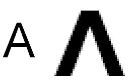 You can see that when we zoom into the letter its edges are smoothed out, so the line doesn't look so "jaggy" when viewed at normal size. If we ignore the smoothing the text looks very blocky. The advantage is that every pixel can be just "on" or "off" (1 bit per pixel) whereas the smoothed version needs values inbetween on or off, which logically takes more space to store on the computer. However! the old version was still storing at as a full colour value (32 bits per pixel) anyway for some reason, either pure white or pure black, so what i've done is store it as 4 bits per pixel so we have 16 possible smoothing values.
There are other caveats to both systems but i've written quite a long first post (during the excessively long compile times) so i'll finish there.
And oh yes, i am aware that "what the font" is a website, and yes, i am aware that it is great: www.whatthefont.com
posted by Jonny Hopper at 11:12 AM
![]()


2 Comments:
Smoothly done Johannes!
"Smoothly done"! Geddit? Eh? Eh?
oh dear ed..
Post a Comment
<< Home